
Twitter Lite
- Interaction design
- Design systems
- Visual design
- Product strategy
In 2014, Twitter recognized that its aging mobile web site was in need of a ground-up overhaul. From the small team’s inception, we viewed it as an opportunity to:
- Create a reliable tech stack that was easier to maintain and scale
- Realize a performant that would use less data and be more resilient
- Redesign the UI to use a responsive, component-based system to foster rapid iteration
I was lucky enough to be on the founding team, leading the design efforts along side Dave Bellona from the beginning of the project until its initial launch.
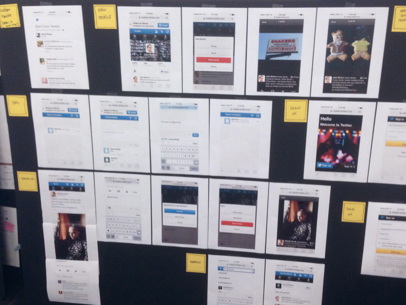
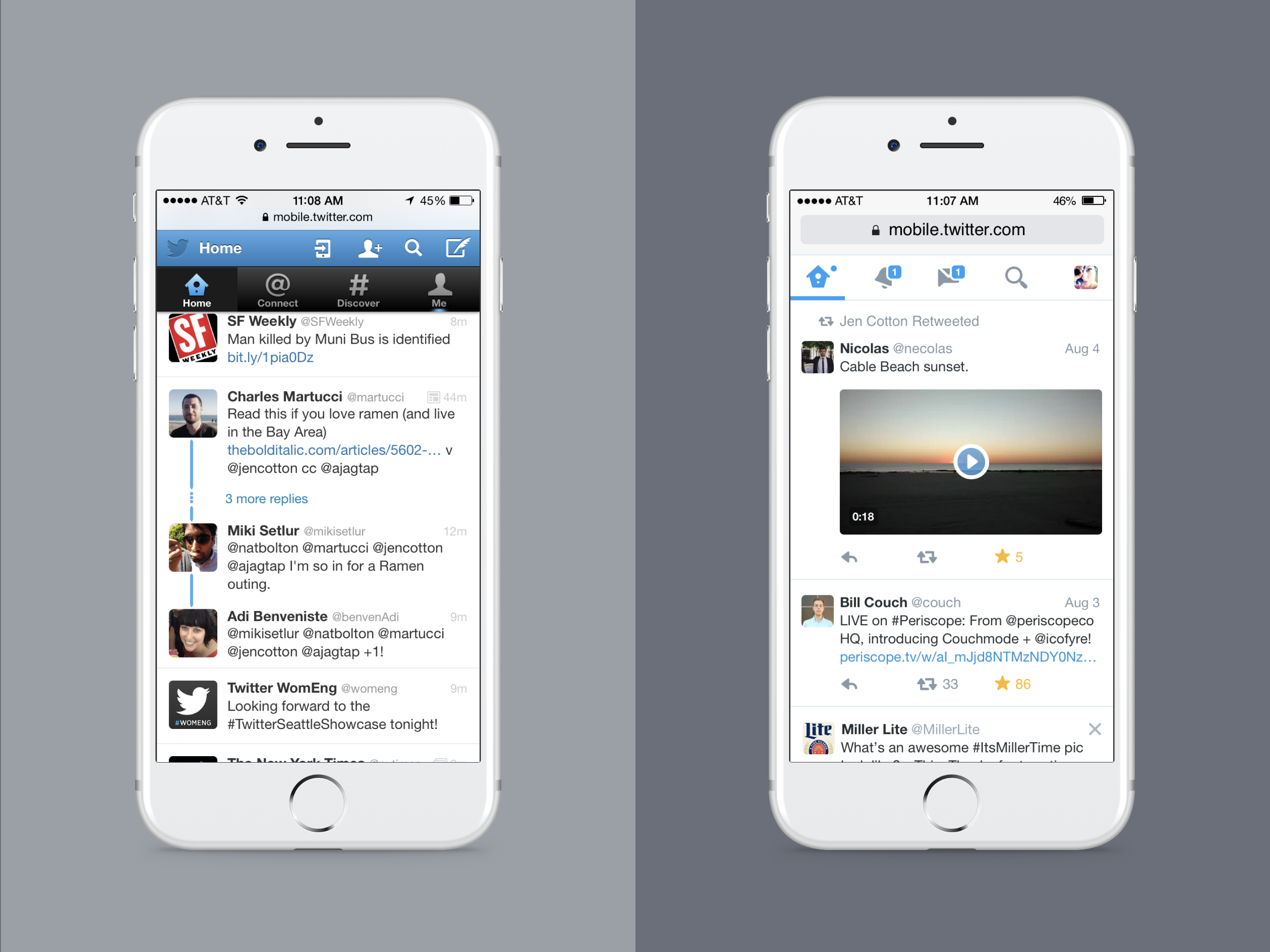
Blank slate
Our first step was to assess, evaluate, and – where possible – consolidate the existing patterns in use across the mobile site.
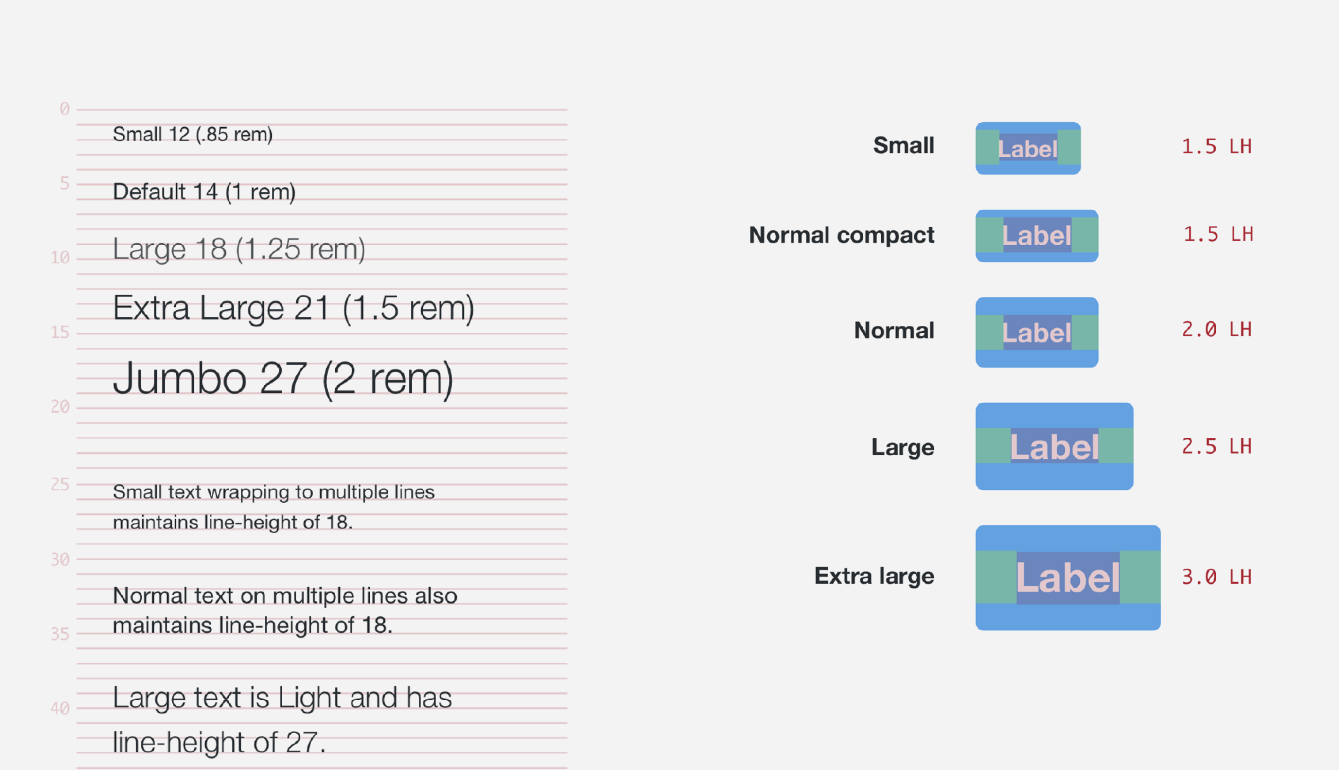
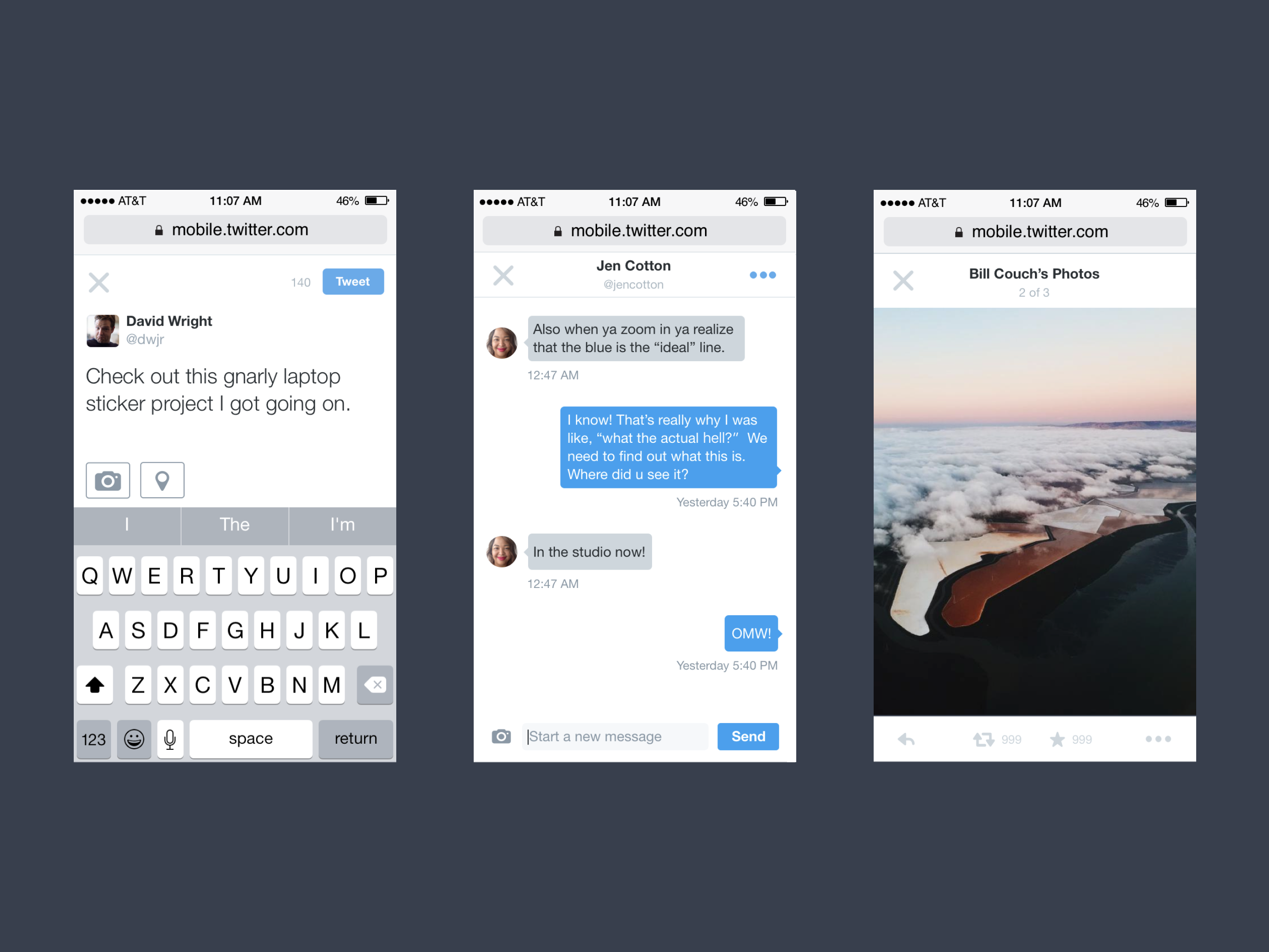
The next step was to begin exploring a system of fundamentals, namely a grid and type system, that would be the basis of the new design system. We created a custom grid system that accommodated the unique layout of Tweets, but would also be flexible for other uses.
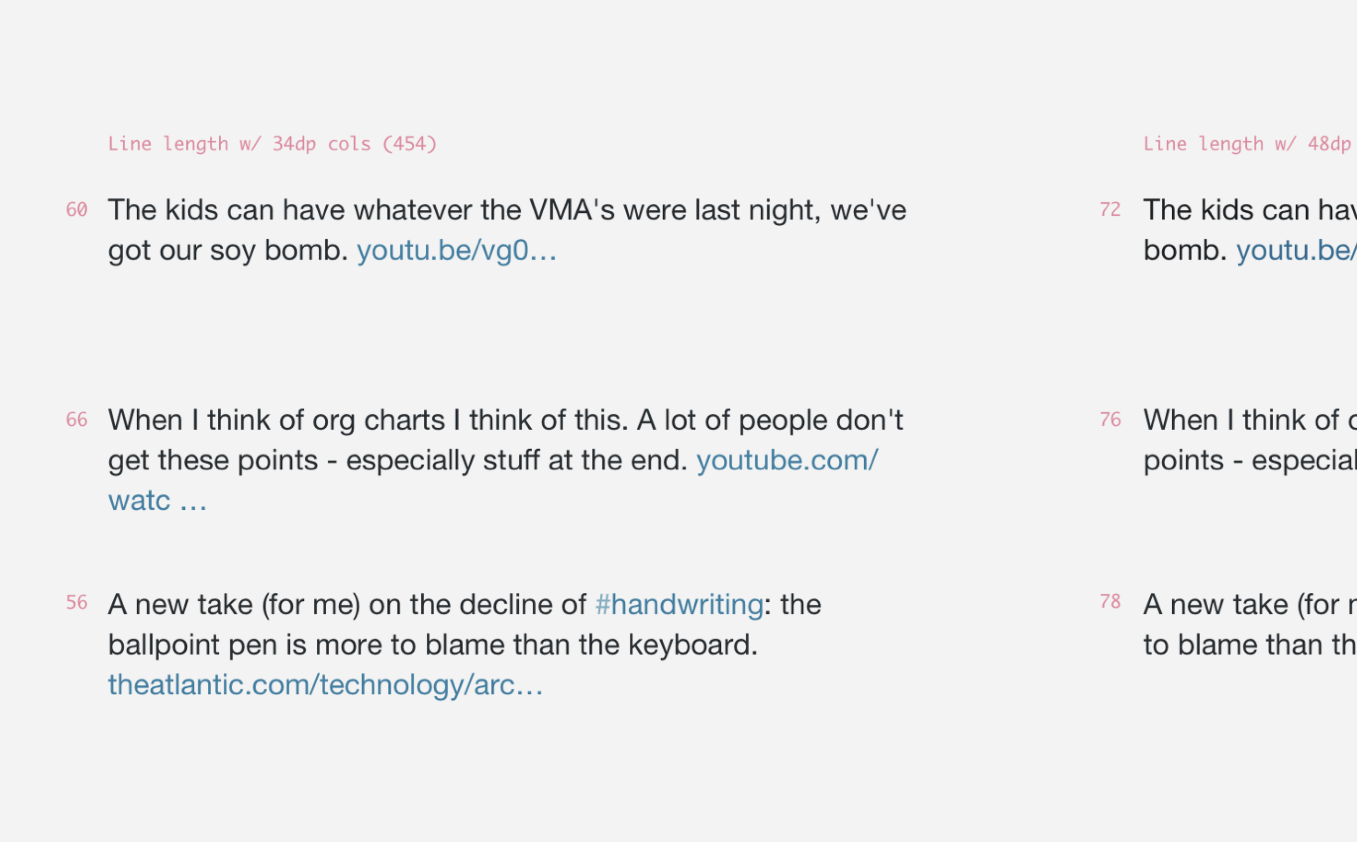

The typography system was tied closely to the viewport ranges we established. Each viewport has a base type size, from which we derived horizontal and vertical spacing units. We established the small screen size as the default starting point for all designs. We'd optimize for this design first, then adjust the designs for larger sizes.
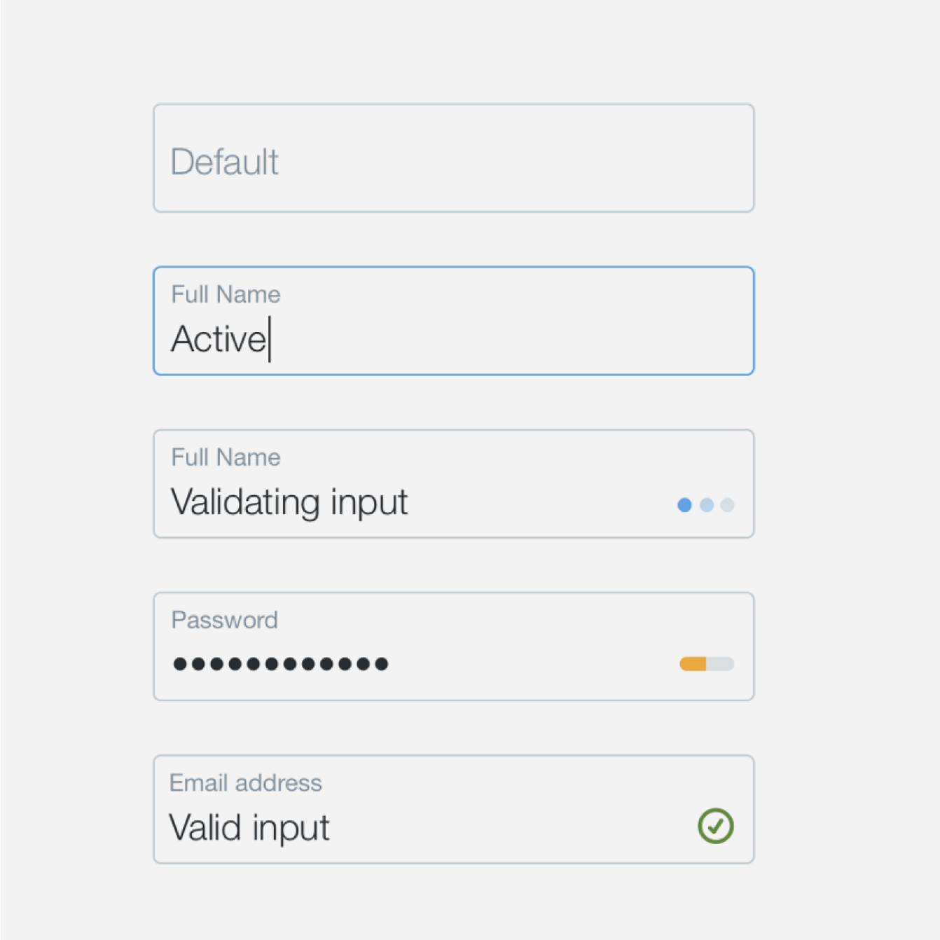
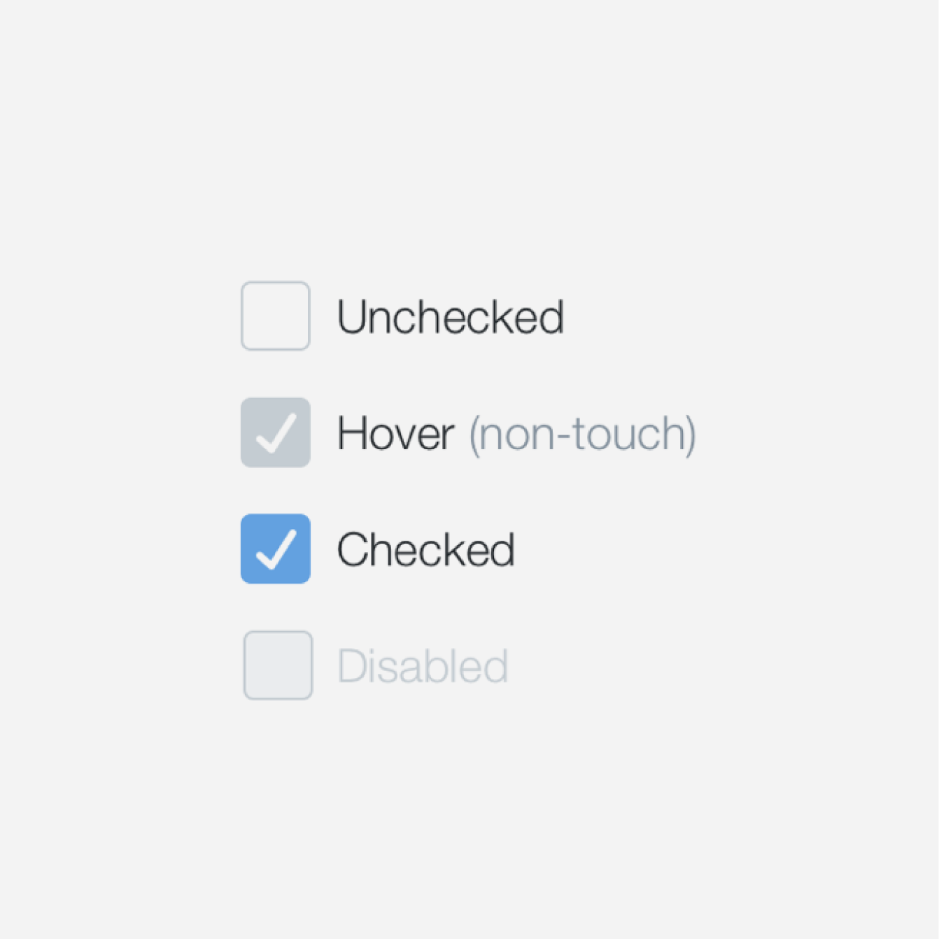
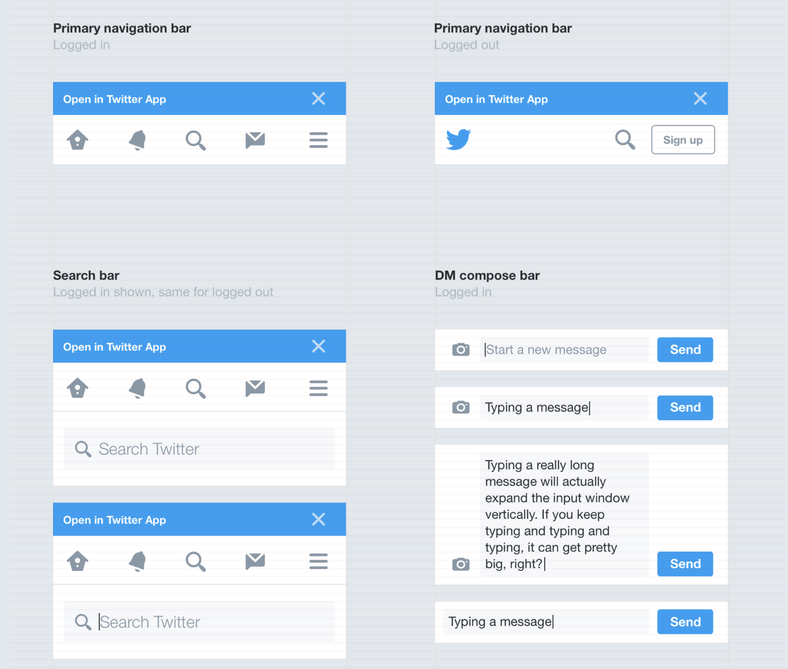
Since we were designing the components for use across multiple viewports, we needed way for engineers and designers to describe them without relying on fixed pixel measurements. Where possible, we borrowed from established patterns like Flexbox.
When the system began to shape up, we started sharing our plans across the company, introducing individual teams to the initiative. We used this opportunity to fine-tune the system and collaborate on translating each team’s existing features to the new platform. It was a great opportunity to get ahead of any concerns with the project and make adjustments to ensure that we'd see the adoption we hoped for.
Nearly two years after the initial launch, Twitter Lite is now available as a Progressive Web App. It is exciting to watch as the team continues to iterate on the platform, rolling out improvements and new features.
Press & more information
- Twitter Lite is a faster, leaner mobile web version of Twitter - The Verge
- Twitter's Lite App reaches 24 more countries - Engadget
- Google Case Study: Twitter Lite PWA - developers.google.com
- How we built Twitter Lite - Twitter engineering blog / @necolas